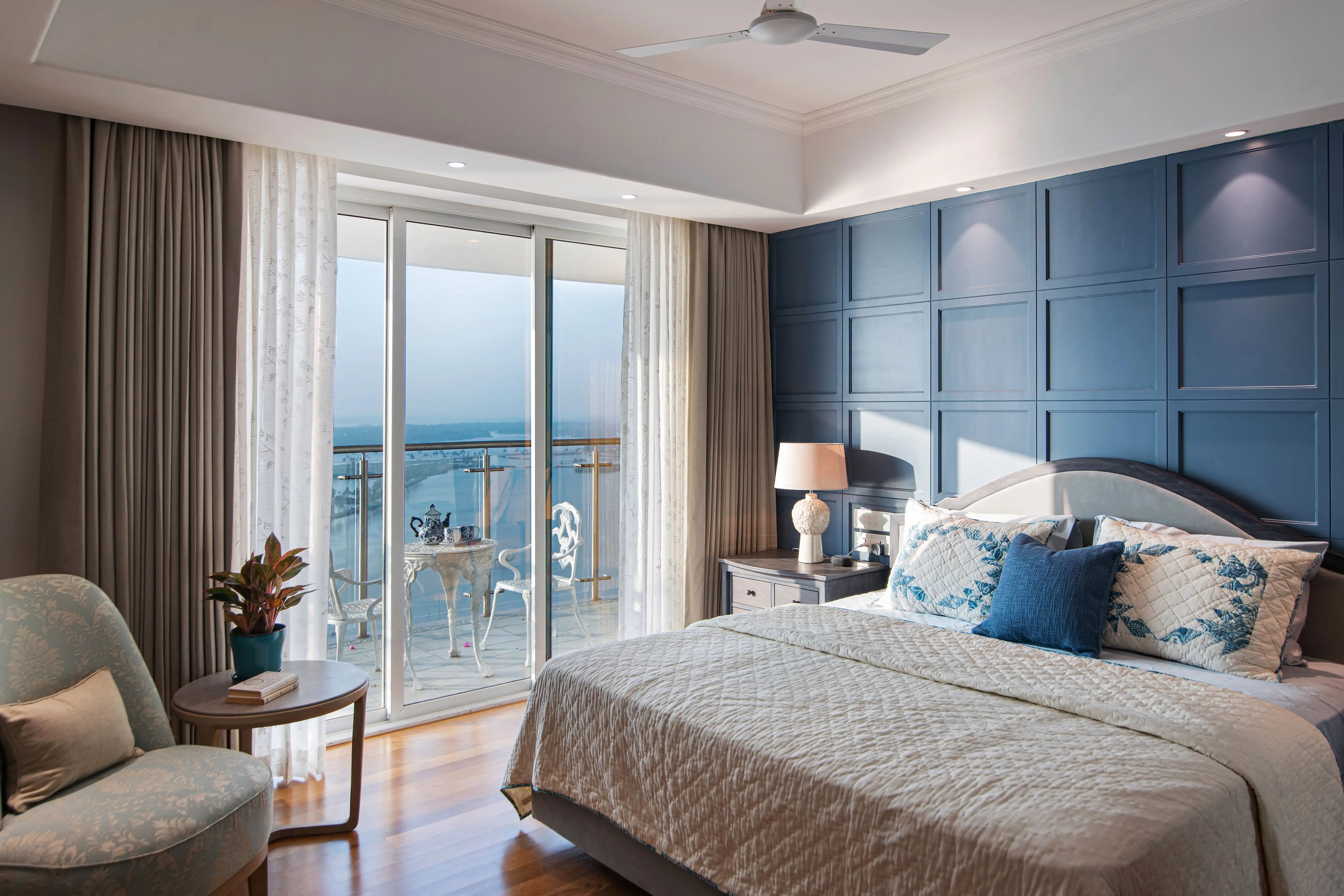
- Colors add that brilliant aspect to our surroundings while pouring with beauty in every elegant detail. Color creates emotions in many forms of art. Designers use these media to create enriching experiences they want to share with their target groups. When you enter a beautiful home with color aesthetics so stunning, it makes you feel like you are entering into another world. Collaboration with a proficient interior designer who loves or appreciates contemporary design would do a difference in inspiring these vibrant interactions. An example would be that entering into a room painted by soothing colors of Pacific blue and green creates tranquil feelings. best Color combination wisely put with taste results in perfect visual combinations and harmony that will always be created into interiors. It would however take time and a lot of detailed observation. In this blog, we are taking you through this vast world of home interior aesthetics and ideas on how to pick up the right color combination for your walls and home interior.
colour concept basics
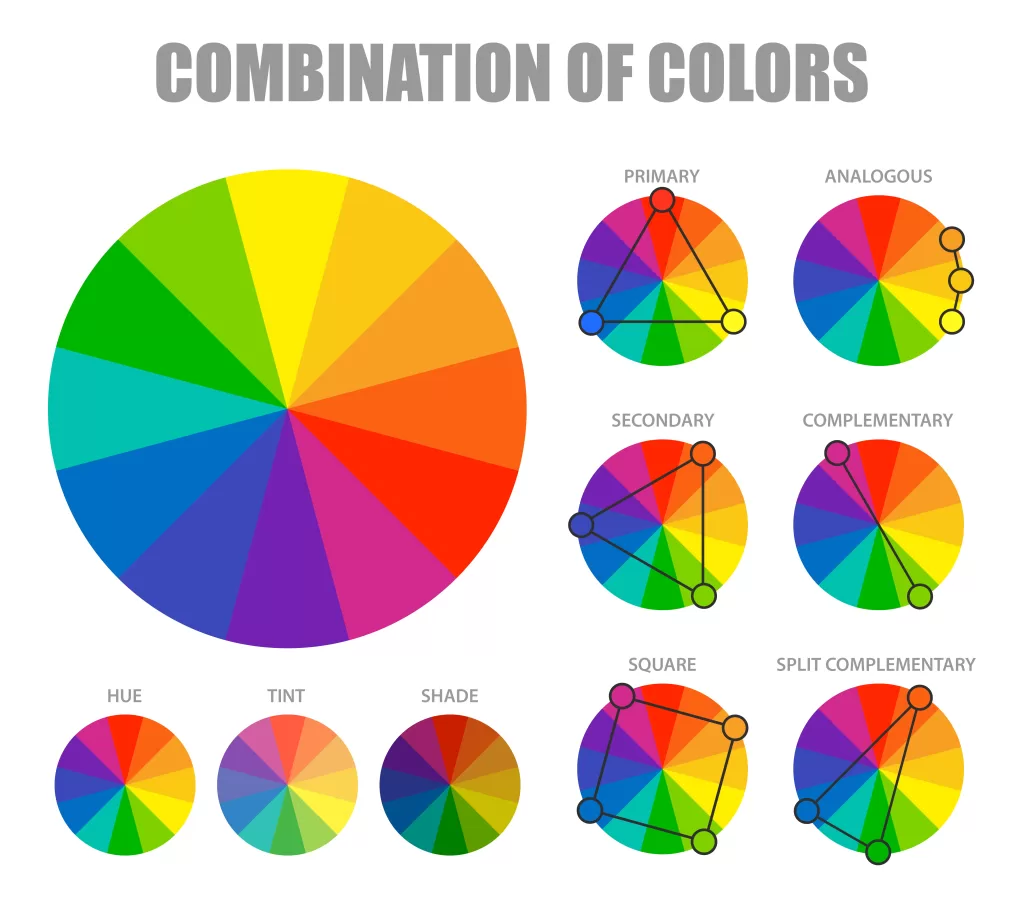
Understanding these core concepts of color is very important for a harmonious, aesthetically pleasing space. Let’s get into it a bit deeper on how each component—hue, saturation, shade, temperature, and tone—plays into interior design and how you can take these elements in your home.

1. Hue
Each hue comes with its own psychological implications.
For example: Warm Hues (Red, Orange, Yellow): These colors often evoke feelings of excitement and energy. They can enhance social interactions and are best used in spaces meant for gatherings, like living rooms or dining areas.
Cool Hues (Blue, Green, Purple): These colors are calming and can contribute to a sense of tranquility. Ideal for bedrooms or meditation spaces, they promote relaxation and focus.
When selecting colors for your space, think about how you want each room to feel and function. Mixing different hues can create vibrant combinations, while sticking to a single hue in varying shades can foster a more cohesive look.
2. Saturation & Shade
High Saturation: These bright, vivid colors pack a lot of punch in terms of impact and really create focal points in rooms. Use high saturation very conservatively with accessories or accent walls; otherwise, it can totally overwhelm the space.
Low Saturation: Soft muted colors create a gentle backdrop with depth that doesn’t feel distracting. These are phenomenal for larger areas or even open concepts so that the spaces feel airy and inviting.
Shade: This feature deepens color. Dark shades can provide drama and luxury, especially for intimate areas like dining rooms or small reading nooks. Light shades can provide a sense of openness, making the space appear bigger, ideal for small bathroom or office settings.
3. Temperature
Warm Colors: They are ideal to energize any space. Ideal for locations where action is happening, such as kitchens and playrooms.
Cool Colors: Best used for resting and reflecting. Use in bedrooms or quiet rooms to create a sense of serenity.
To balance the look, warm and cool colors can be mixed together to create contrasting areas within one room or to direct traffic from one room to another.
Colour Psychology
Color psychology is one very worthwhile concept used in art, branding, and interior design to evoke a response. Using an endless array of color combinations or the impact of a single color makes all the difference when improving your interior space. This field researches how colors influence our perception of spaces and impact our emotions. By clearly defining the feelings you want to evoke in each room, you can select the ideal colors to achieve that effect.
Blue
Blue is often employed in study and work environments to foster a sense of calmness.
Red
Red infuses energy and excitement into your walls and overall home decor.
Purple
Purple evokes a captivating sense of curiosity and stimulates the imagination.
Black
Black creates a dramatic and luxurious atmosphere in a room.
Green
Green is also known for relaxing and helping people focus.
Color Schemes
Color schemes are a group of colors that blend well and can be safely used in your home design to have an aesthetically appealing outcome. They contribute to a stylish and attractive atmosphere.

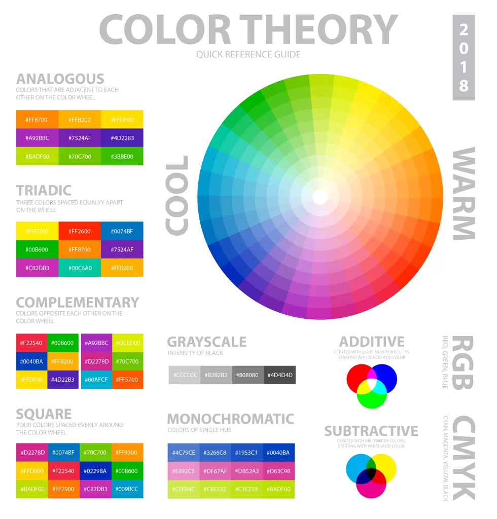
Monochromatic Color Scheme
This scheme is based on using different tints of one color that creates a peaceful and harmonious interior.
Complementary Color Scheme
A simple yet dramatic approach that combines colors that are directly opposite one another on the colour wheel.
Split-complementary Color Scheme
This color scheme combines a primary color along with the two colors which are beside its complementary color.
Analogous Color Scheme
This is a highly aesthetic color scheme that incorporates colors next to each other on the color wheel.
Triadic Color Scheme
This option makes use of three colors, evenly distributed on the color wheel, avert conflicts with colors and provide a harmonic as well as elegant view.
Choosing the best color combinations for wall and home interiors is an immersive and vibrant journey. It is a process of deciding the emotional identity of your space and reflects your own. A safe haven with aesthetics exuding exquisite beauty and charm is indeed a dream that can come true. Seeking the assistance of a professional interior designer with good experience and craftsmanship will make the aesthetic ride more easy and comfortable. We hope this blog has helped you with ideas on how to choose the best color combinations for walls and home interiors.

